Portfolio
Visual Brand Identities
A selection of visual brand identities I’ve worked on, including a few fictional concepts.
Sunchaser
Sunchaser is a fictional lifestyle brand created to explore a bold, spirited visual identity grounded in sunshine, freedom, and adventure. Think road trips with your best friends, salty skin, surfboards strapped to the roof, and an eternal summer that never takes itself too seriously.
Goal
The aim was to create a brand that feels effortlessly cool girl, a little bit nostalgic, and wildly alive. The kind of brand that could live on the side of a surf shack, in the print of a retro beach towel, or across a bottle of reef-safe sunscreen.
Approach
Even though it’s fictional, I treated it like a real project, starting with a strong emotional direction & letting strategy lead the visuals. The goal was to balance vintage charm with a fresh, modern spirit.
The palette is sun-soaked and vibrant without feeling artificial; playful and full of personality, grounded with warmer tones to add depth and versatility. This contrast mirrors the brand’s energy: lighthearted and full of movement, but lived-in and trustworthy.
The primary font is loud and retro – a modern nod to 70s surf magazines and vintage signage. The scrapbooky secondary font brings a handwritten, storytelling vibe, while the clean paragraph font keeps everything clear. Hand-drawn illustrations add spontaneity and a DIY feel – surfboards, jeeps, waves, flowers, and sunshine – visual exclamation points that feel like the kind of marks you’d doodle in your journal while waiting for the tide to come in.
Result
Sunchaser captures the energy of a coastal road trip: sun-drenched, joy-fuelled, and a little rebellious. Built for barefoot explorers and nostalgic dreamers chasing golden hours like it’s their full-time job.
While this isn’t a full client project or brand strategy deep dive, it’s a visual exploration backed by thoughtful design choices – a vibrant example of how strategy & design can meet to build a brand that pulls on the exact feels that you want your audience to feel.
Stillwater Studio
A calming, thoughtful brand identity for a holistic women’s studio.
Stillwater Studio is a space for deep reconnection. Through somatic movement, nervous system healing, and creative embodiment practices, this studio helps women return to the intelligence of their bodies and cultivate a sense of grounded wholeness.
Goal
Stillwater Studio was created as a fictional brand concept to explore a slow, soul-nourishing visual identity for a women’s space centered on movement, restoration, and inner connection. The intention was to create something elegant, grounded, and serene, evoking a feeling of slowness without stagnation.
Approach
The colour palette was designed to feel calm, clean, and deeply restorative. These shades anchor the identity into depth and stillness, while also adding a natural, earthy touch for groundedness & connection. The contrast between the darker and lighter tones helps create a visual rhythm, mimicking inhale and exhale.
The heading fonts brings an elegant structure to the identity, while also adding softness, flow and a personal feel, representing intuitive intelligence. The clean paragraph font balances the system, and embodies clarity in longer copy.
Custom handrawn illustrations were added to reflect sacred geometry, breathwork and gentle energy patterns, grounding the brand in a sense of ritual and subtle transformation. These elements were designed to be used as patterns, accents, or standalone marks, adding depth, neuance & an underlying voice without overwhelming the design.
Result
The result is a visual identity that feels slow, intentional and feminine, like water meeting stillness. It holds space for both personal transformation and grounded presence, making it ideal for a holistic brand built around breath, embodiment, slow movement and (feminine) wisdom.
Lumen & Root
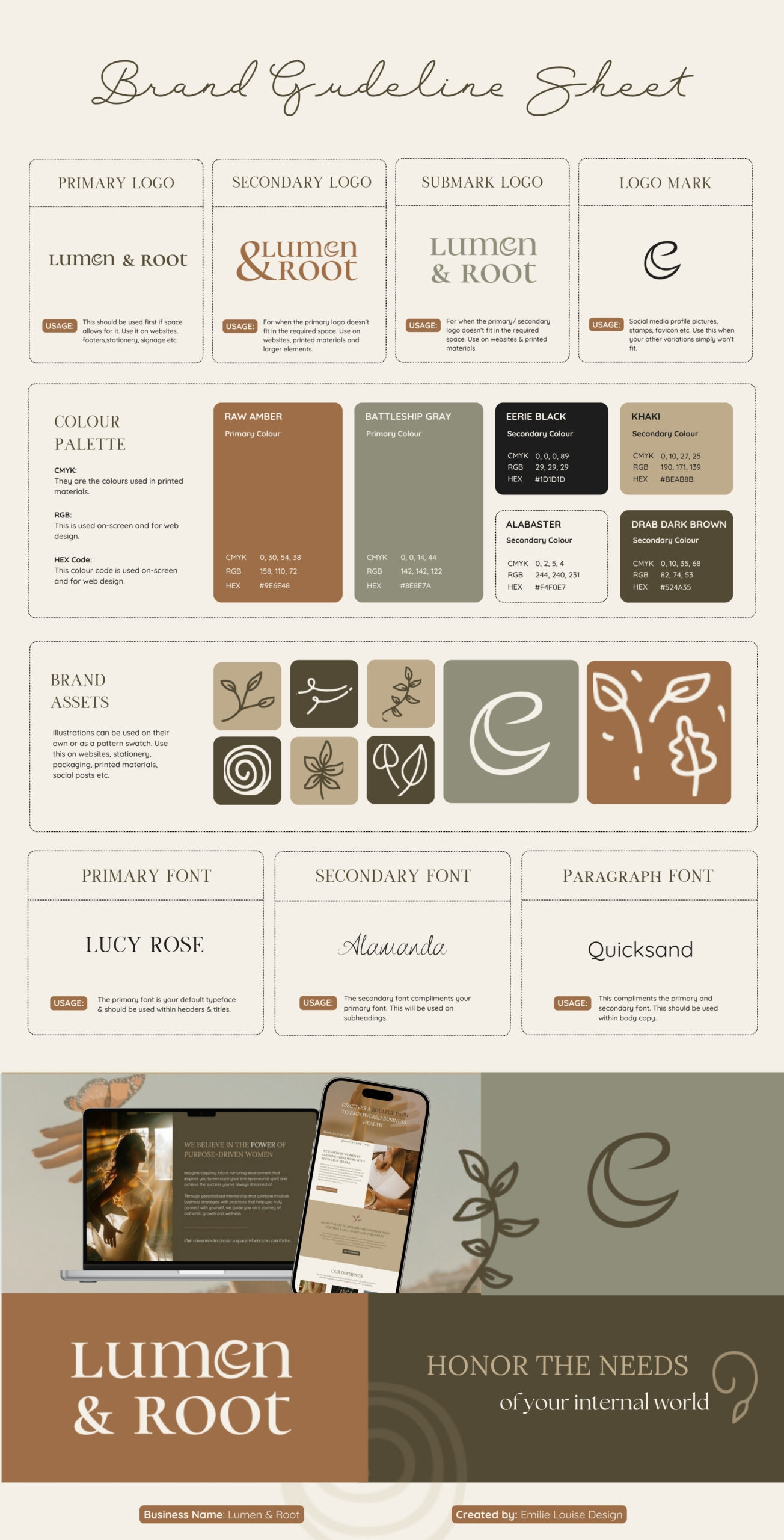
Lumen & Root is a soulful coaching and business mentorship brand that helps purpose-driven women build businesses rooted in intuition and alignment, in a way that feels natural, sustainable, and true to them.
Goal
The goal was to visually capture the balance between clarity and grounding – creating a brand that feels both illuminating and earthy, structured yet fluid, refined yet deeply personal.
Approach
To bring this vision to life, I created a brand that blends a refined organic warmth with quiet confidence.
A mix of clean, polished type with a softer, handwritten accent adds both professionalism and personality – polished yet approachable. Earthy browns, muted greens, and soft neutrals create a cozy, welcoming feel – like a space where deep conversations & transformation unfolds. These colors reflects the brand’s connection to intuition, growth, and feminine structure. Hand-drawn leaves and natural elements represent growth, rooting, transformation and alignment with nature, reinforcing the brand’s deeper message. A set of logos ensures consistency across websites, social media, and print. The mix of soft curves and structured lettering mirrors the brand’s approach: a blend of flow and strategy.
The combination of warm tones, gentle textures, and natural imagery creates a brand that feels authentic, empowering, and deeply inviting.
Result
The final brand identity embodies Lumen & Root’s mission; a space where women feel safe, seen, and supported as they grow their businesses. It’s a brand that’s both deeply personal and highly professional, ensuring a consistent, meaningful presence across digital platforms, print, and client experiences.
Rivet & Rebel
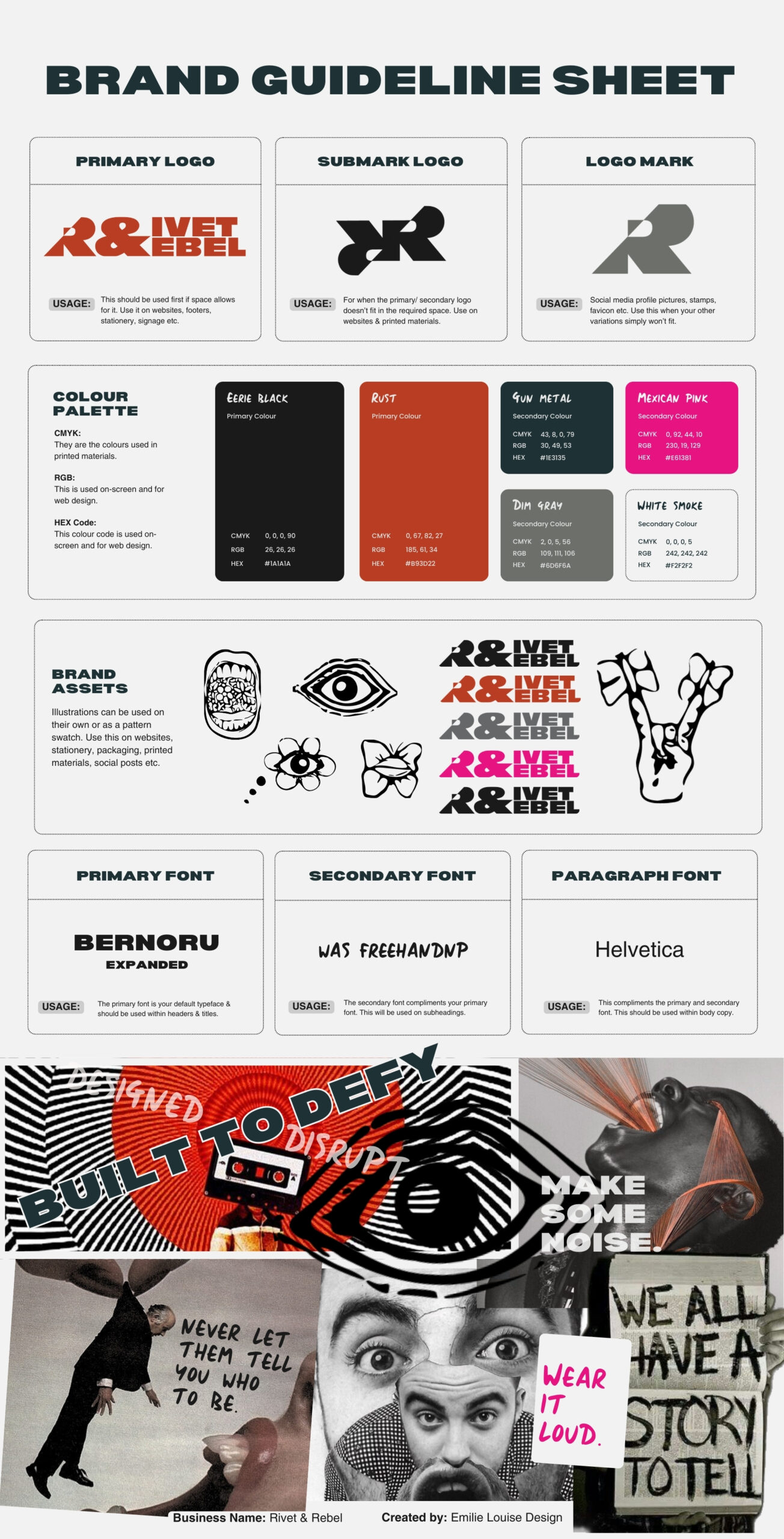
Rivet & Rebel is for the bold, the disruptors and those who refuse to fit into a mold; independent artisans, underground creatives, and self-made entrepreneurs who reject the polished, corporate aesthetic in favor of something raw and real. Rivet & Rebel is for those who build their own way, whether it’s handmade leather goods, metalwork, brutalist art or rebellious indie businesses.
Goal
The goal was to create a bold, unapologetic visual brand identity that captures that energetic, loud & rebellious spirit – a DIY, raw, underground and unfiltered aesthetic, yet strategic and cohesive.
Approach
To bring Rivet & Rebel to life, I focused on defining a clear Identity through a mood board capturing the brand’s energy and movement, and establishing core values of rebellion, individuality, and fearless self-expression.
A strong identity was built around bold, industrial typography, paired with an edgy handwritten font for a raw, DIY feel and a simple, no-nonsense paragraph font for balance. The blocky, high-impact logo and stencil-inspired ‘R’ mark reinforce the brand’s statement-making presence, while hand-drawn symbols and collage-like visuals enhance the underground aesthetic. A gritty black and deep gray base keeps it grounded, with rust red for vintage rebellion and electric pink for an unexpected, disruptive edge.
Result
The final brand identity strikes a perfect balance between structured defiance and creative chaos. The brand guideline sheet serves as a comprehensive toolkit, ensuring consistency while leaving room for raw expression.
Loom & Light
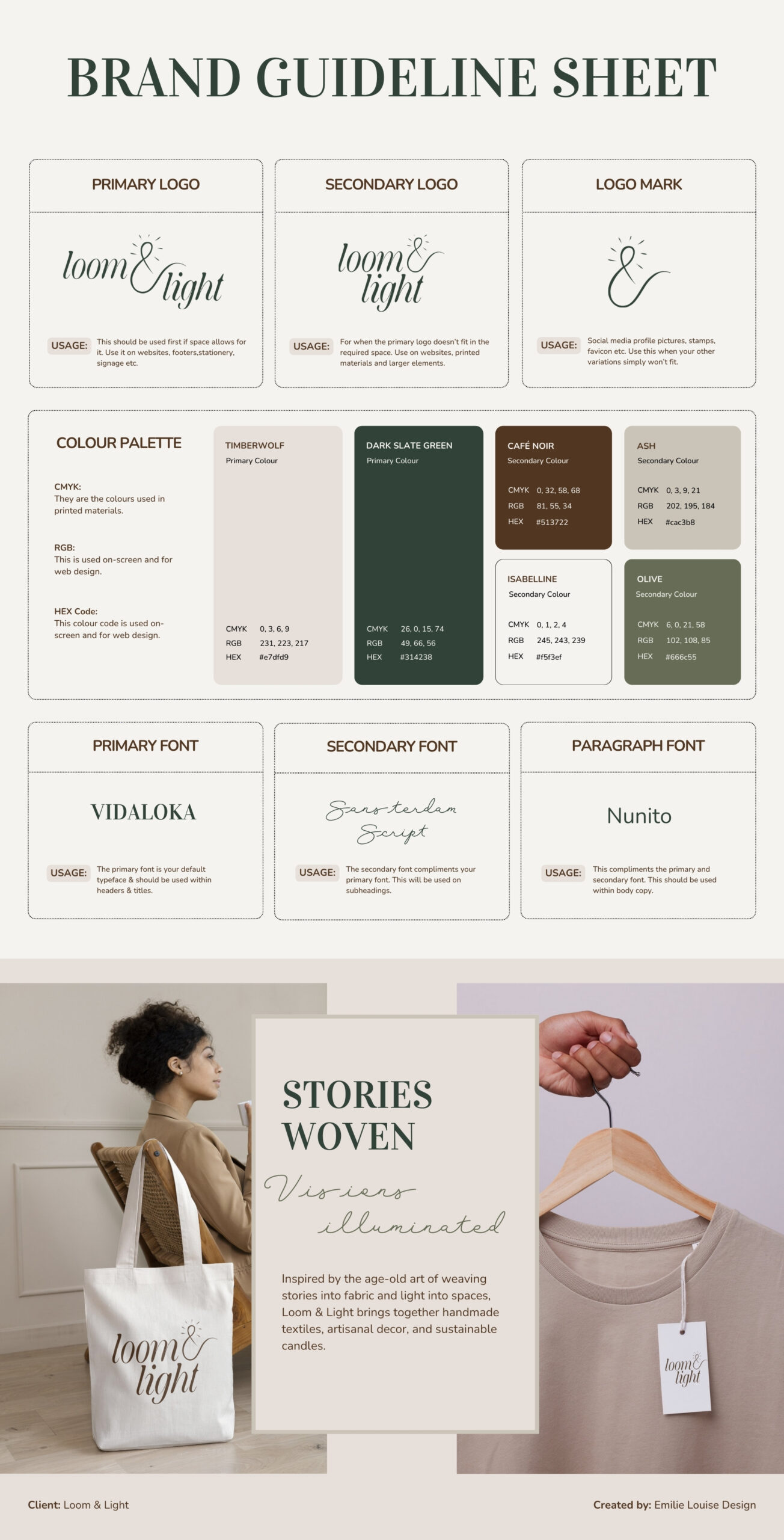
Loom & Light aims to create spaces that feel both intentional and soulful through artisanal home and lifestyle goods. They offer more than just products, they also provides pieces that tell stories, evoke emotions, and bring a sense of calm focus to daily life.
Goal
A visual brand board that establish a clear, intentional and visually cohesive framework that reflects Loom & Light’s soulful identity. The goal was for every element to carry the same warmth, craftsmanship, and intention as the products themselves.
Approach
Through my approach, I focused on simplicity, warmth and intentional storytelling to ensure every detail feels connected to the brand’s purpose.
I used a balance of soft, earthy tones, paired with clean yet warm typography, which creates an inviting and elevated aesthetic. Each design choice have been considered into a larger narrative of warmth, craftsmanship and light, evoking the feeling of being wrapped in intentional care.
Codes of Astara
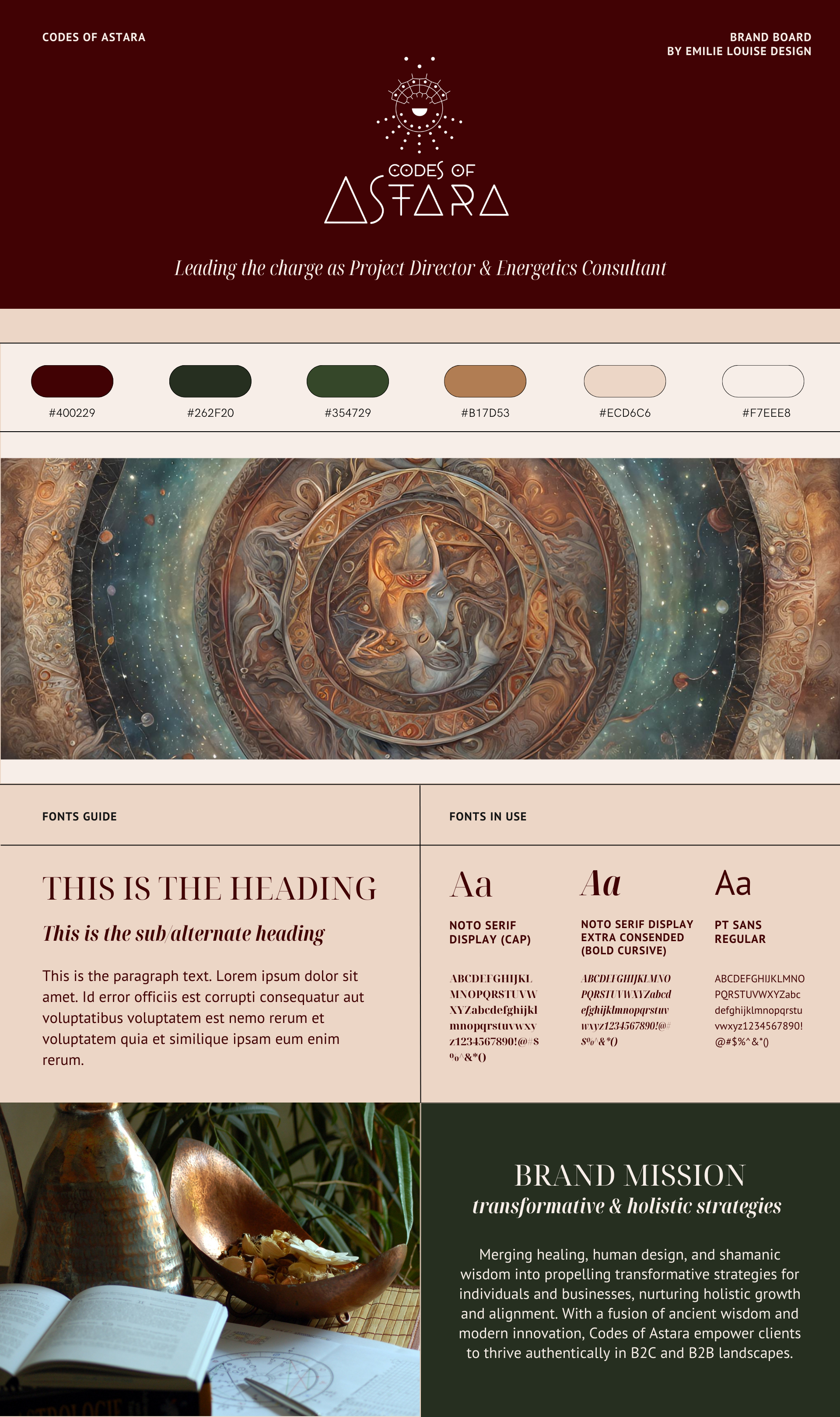
A Project Director & Energetics Consultant focused on merging healing, Human Design, and shamanic wisdom into propelling transformative strategies for individuals and businesses.
Goal
Create a visual brand board that displays brand colors, fonts and composition (logo not included) of a personal holistic brand; Codes of Astara.
Approach
I wanted to create something that resonated with the owner of the brand; Olera. My focus was on her strong aura, her Human Design energy type (Manifesting Generator) and her personality, while also taking in the mysticism and professionalism of her brand. A combination of deep greens and burgundy, complimented with shades of beige truly reflects her deep, multipassionate and knowledgable soul.
The fonts was also based on her aura, while also considering her wish for a more feminine look than her last brand fonts and colors.
The logo is her own creation.


